The Overview is the home of your running stats. It provides a big picture snapshot of your running divided by month, year, and all time (up to 10 years).
Navigating your stats is easy. Switch time periods for the Overview pages by clicking on the calendar or clicking through any of the bar graphs under “Distance per month”. By Run goes to your most recent run. And List shows a list of your runs for the current month you’re viewing.
Your Overview is designed to help you:
Understand your training cycle
Running is usually cyclical, and every training cycle tends to progress in the same way. You start by building a base, combine distance with speed, reach peak fitness, and eventually taper. Because of this, you’ll have peaks and troughs when you look at your training over time. Eventually, the peaks will gradually increase while the troughs decrease, because as you get fitter, your baseline changes and so your next peak will be higher. This is often referred to as progressive overload.
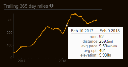
On Smashrun, you’ll get an idea of your yearly training cycle by looking at your Trailing 365-day distance curve on the All Time view. Although, the length of an ascending slope (and the total volume) will vary between runners, the general takeaway is that it’s good idea to include periods of rest before a subsequent push to train harder. This limits the chances of burning out or getting injured.
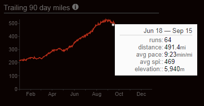
On the other hand, if you’re optimizing for performance, you’ll want to look at your Trailing 90-day curve within the year view. Most training programs require between 12-18 weeks of preparation before an event. That means the bulk of your preparation and peak conditioning takes place in the last 90 days before a race, so your graph might look more like a steadily increasing curve before race day.
Finally, your Trailing 7-day curve in the month view shows how closely you’re staying within your weekly distance goal(s). It also gives you an idea of how all your runs of varying distances are distributed on a weekly basis. This is important for a couple of reasons: it helps you stay consistent every week and, more importantly, you can see your highest trailing 7-day distance.
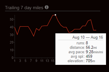
For example, you might peak at a 50mi week during marathon training, but still end up with a trailing 7-day peak distance of 56mi because you had a long run on Sunday and two medium long runs on the following Tuesday and Thursday.
Your trailing distance is information you can use to better understand your responses to cumulative fatigue.
Establish training consistency
In running, perhaps more so than in other sports, consistency is everything. Whether it involves steady pacing, doing a long run each week, adding speedwork, or just taking days off, successful training requires consistency. For many runners, consistency starts with their weekly distance.
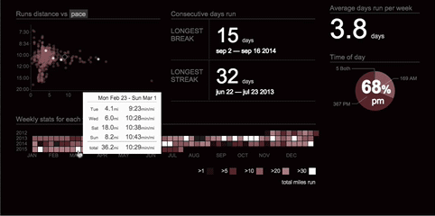
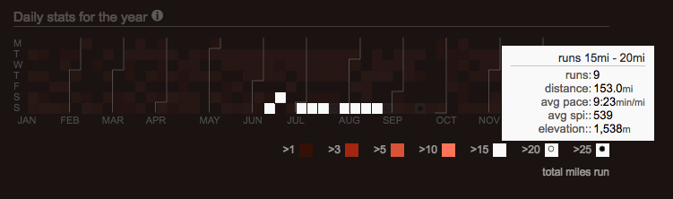
Within the All Time view, the calendar heat map visualizes your weekly training volume for every week in any given year. Mouse over a tile to see the runs included within that week, or mouse over the legend to see which weeks had similar training volumes.
The calendar heatmap exists within the year view and the month view as well. When viewing a year, it shows each run you’ve logged throughout the year and, when viewing a month, it divides the month into weeks and shows your daily training volume for the month.
In the All Time view, use the weekly stats heatmap to quickly identify your high and low volume weeks of training across several years. In the year view, mouse over any of the distance brackets of the legend to see how often you’re incorporating various distances into your training schedule.
For example - a marathoner who wants to see how often they ran longer than 15mi during a 4-month training program would mouse over >15.
Another way to track consistency is to look at the “Runs distance vs. pace” chart, which is a scatterplot of your runs within a given period. If you’re trying to improve your time for a specific distance, this is a quick and easy way to see your progress for the year.
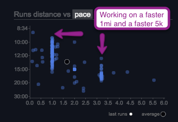
You can also move your cursor within the scatterplot to show the percentage of runs faster than a certain pace and/or greater than a certain distance.
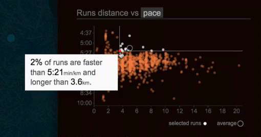
And, most importantly, this chart shows how your runs are distributed. So you can answer questions like:
- How often am I running long?
- Am I running enough easy runs for recovery?
- And, at what distance or pace does the bulk of my training entail?
Track your progress
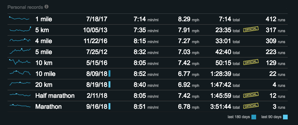
There are a lot of different ways to track your progress on Smashrun but, before you can begin to improve, you’ll have to know what you’re measuring. For many runners, speed is an easy proxy for progress. On Smashrun, you can track your personal bests within each period (All Time, by year, and by month) and see your fastest run(s) of a similar distance on the By Run page.
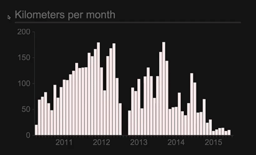
Alternatively, you can use distance to measure progress just by looking at your distance per month. You can even mouse over the y-axis to figure out the number of months you ran greater than a certain distance or hover over specific months to see the number of runs and total distance for that month.
If you’re tracking frequency, you can keep an eye on your longest break/streak on the month view or by looking at your “Daily stats for the year”. There are also badges to motivate you to try running different streak lengths!
But, perhaps, one of the best ways to track your progress is to look at your demographic ranks. When you compare yourself to runners who are most similar to you, the thresholds for the different rank categories become more relevant and attainable.
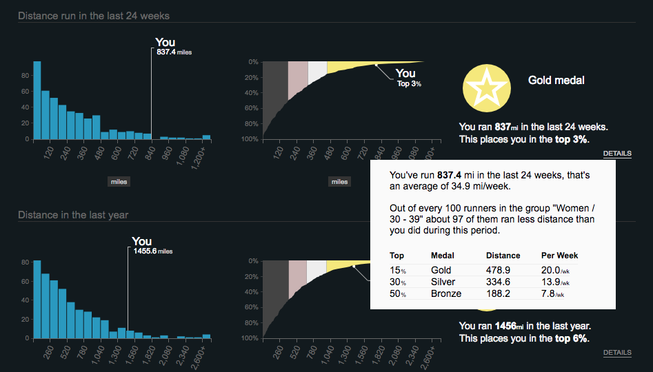
Remember that there’s an inherent disadvantage to benchmarking yourself against the wrong demographic. If, for example, you choose “Everyone” as your demographic - you’ll be comparing your training to a wide range of runners on Smashrun: 18-year old track athletes, sub-3 hour marathoners, and ultrarunners who run 300+ miles per month!
Whereas, if you choose those who are more like you, then your progress is more measurable and meaningful over time. So choose wisely ![]()
Quick Recap
Your Overview is the home of your running stats and the best place to get a quick-glance analysis of your training history. From the Overview, you can:
- visualize cyclical trends in your training
- see your month over month total distance
- understand your running distribution
- compare weekly stats for each year
- track your longest break/streak
- and get a list of your PR’s for any given period.
Note: you can also set your year or month goals from the Overview, see your longest run for that period, most often/least often run day, average run length, average days run per week, and how your runs are distributed by time of day.
Previous topic: Getting started with Smashrun