One of the things we enjoy most about working on Smashrun is trying to come up with better ways to look at data. Often times, the reason we track our running is because we want to improve it. So it makes sense that when we use an app to track our data, we expect the app to be able to help us understand that data.
On Smashrun, some of that analysis can be done from the Overview pages without having to subscribe to Smashrun Pro, but the bulk of our Pro features enhance existing functionality and are also found within the Analyze section.
On Strava, you have to subscribe to both the Training and the Analysis packs to go beyond the basics of a weekly log and pace graphs.
In Strava’s Training Pack, the key features they offer runners are:
- Custom Goals
- Training Plans
- Race Analysis
- and Filtered Leaderboards
Let’s look at these features within the context of preparing for a race.
Set a goal
Goal setting prevents training monotony. It helps us structure our running in the same way that Training Plans provide a guidepost during training.
Currently, goal setting capabilities are not available to free users on Strava. With the Training Pack, runners can set a weekly, yearly, and segment goals, and see progress within the Dashboard and Training Log.
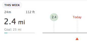
On Smashrun, all users can set a distance goal for every month and year. If you’re a Pro user, you can also use Progress Towards Goals, which shows you the most direct path to reaching and staying on track with your distance goal(s).
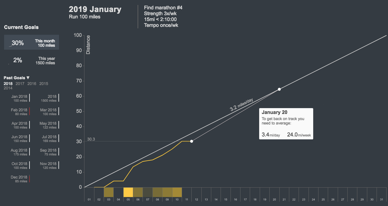
If you fall behind, it tells you how much distance you have to average per day or week, so you can catch up by any future date.
Follow a plan
As part of the Training Pack, Strava offers four training plans created by McMillan Running: a 5k, 10k, half-marathon, and marathon plan. These are all email-based, and there are no features in place to reinforce whether or not you did or didn’t do a scheduled run.You can customize a plan by indicating how often you run and, choose to start on the following Monday or based on the date of your race.
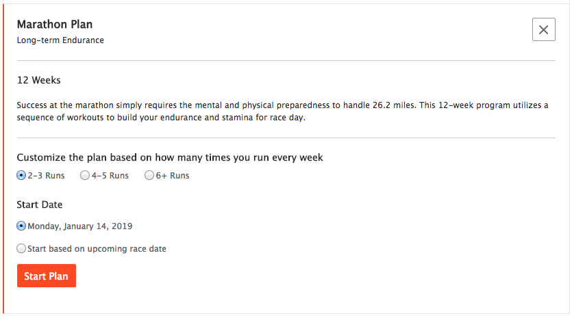
Once you start a plan, you’ll get a daily email reminder and you can preview two weeks at a time. This means you have less flexibility because you can’t schedule runs too far in advance.
You’re actually better off finding a free plan, by picking up a book like Daniel’s Running Formula or Hanson’s Marathon Method, modifying the plan to suite your needs, and use it with RunPlan, which is directly integrated with Smashrun. You’ll at least be able to track your progress relative to your training plan.
Need to create your own training plan? Here are some ideas.
Learn from your best runs
There are two ways we can learn from a particular run, regardless of whether or not it’s a race. We can look at how we performed during that run and we can look at the training leading up to that run.
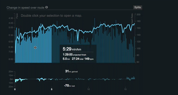
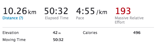
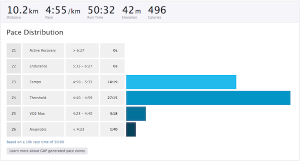
Strava’s Race Analysis feature focuses on the run itself. They describe it as a “detailed post-race breakdown of your performance.” This is what it looks like.
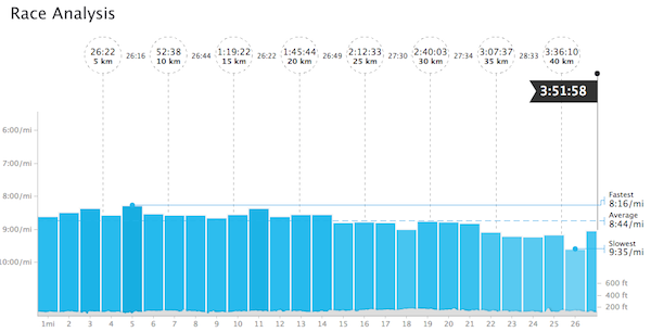
The Race Analysis feature allows you to see your fastest split during the race, your overall average pace, your slowest split, and your race splits either in 5km, 1mi, or 1km segments and the length of the race. The highlight is that you can smooth your pace graph and/or switch to Grade-Adjusted Pace (GAP) in case you ran a particularly hilly course.
On Smashrun, you don’t have to be a Pro user to get most of this information. You can highlight segments of your pace graph on the By Run page for all of your runs. If you want to view 5km segments, just select the first 5k and drag it across the pace graph. You can even figure out how fast you could’ve run a race based on any segment of your run.
And if you’re a Smashrun Pro user, you also get the Pro Map, which is the most detailed view you can have of any given run. You can use it to determine any correlations between your pace, heart rate, cadence, power/form power, and/or hill grade.
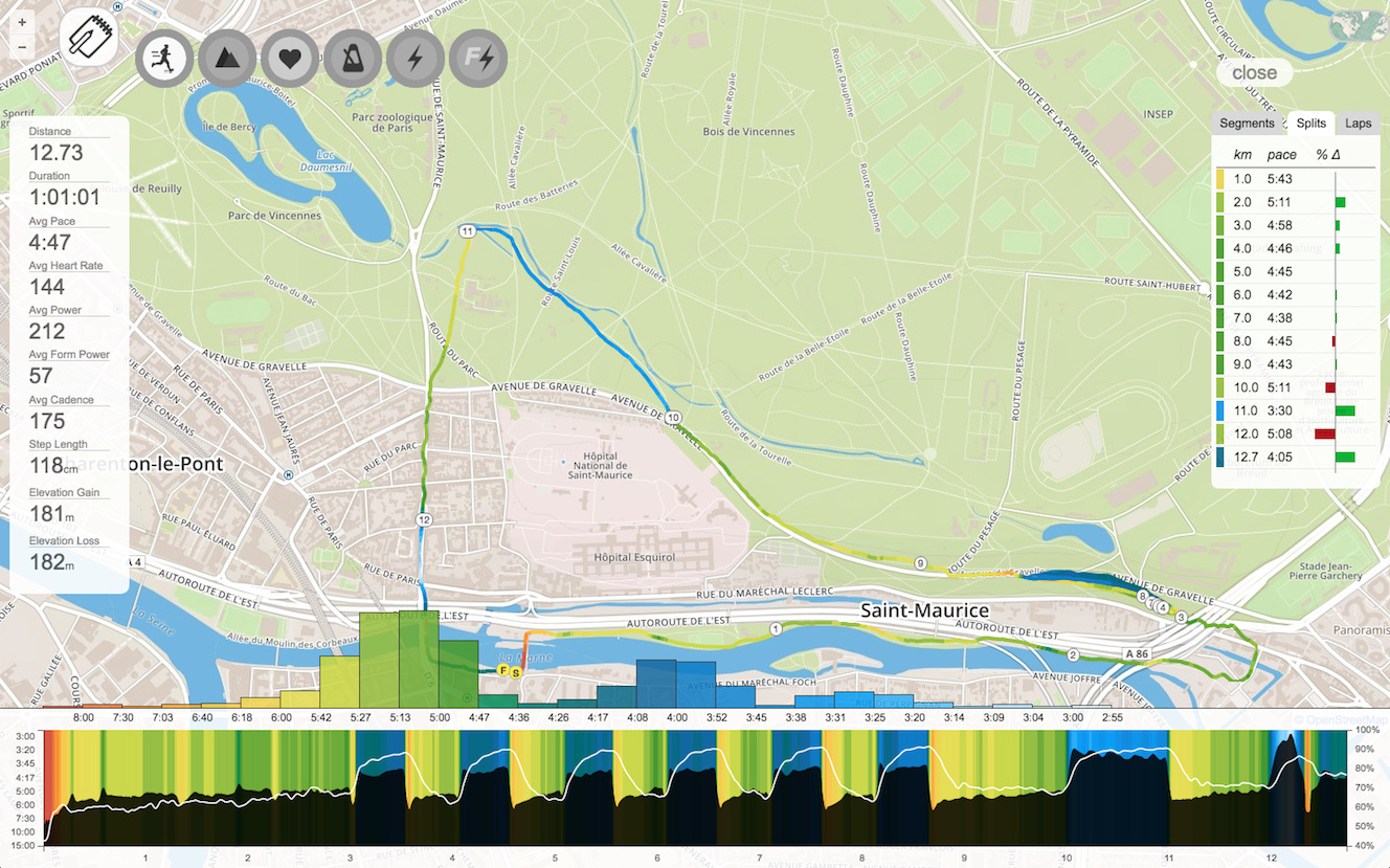
You can highlight your fastest segments, custom laps, specific pace buckets, heart rate zones - any of the metrics that you can visualize on the Pro map. You could even highlight a specific segment of your run on the By Run page and double click it to open that segment in the Pro map.
As a Pro user, you can also use the Analyze Run View to see what kind of training led to your performance for any given run.
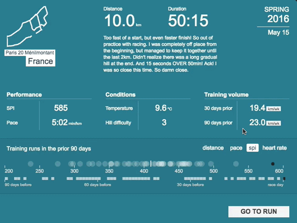
At a glance, it summarizes the training that took place 3 months prior to each race or PR including a distribution of all your runs which you can highlight to answer questions like:
- What percentage of runs were between my tempo and threshold pace?
- How much time did I spend training in my aerobic zone?
- When did I do the bulk of my long runs?
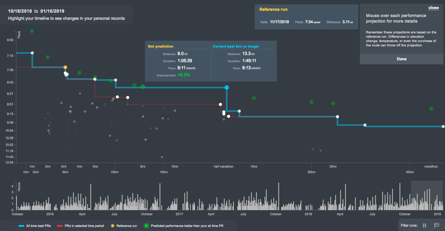
Additionally, you can use PR Progress, to track your historical progress for different race distances. You can even use PR Progress to see all the other PR’s you could potentially set based on a single run. More importantly, it helps visualize how long it’s been since your last PR for any distance and which of your current PR’s you can probably beat.
Learn from other runners
Lastly, a big part of becoming a better runner is learning from others. On Strava, the Training Packs lets you filter the leaderboards of any challenges you join by age or weight. You can also apply the age filter when viewing course records for specific segments.
In a way, this feature allows Strava users to compare themselves or discover similar athletes. You can use it to flip through the different age/weight groups to see who’s the fastest and who runs the most distance or has the most cumulative elevation gained in any demographic. And if they have a public account, you can click through to see their profile.
On Smashrun, we try to make it easier for you to compare yourself to similar runners. Unlike Strava’s Filtered Leaderboards, Smashrun’s Demographic Ranks is an intrinsic part of the platform, and it doesn’t require Smashrun Pro.
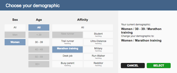
Our demographic ranks are made up of three components: sex, age, and affinity. Once you choose a demographic, you’ll see how you compare to runners in three different categories (distance, devotion, and speed) over a trailing period of 1 week, 1 month, 90 days, 180 days, and 1 year.
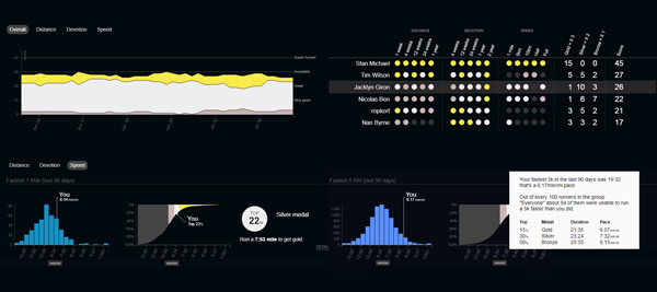
Choosing a demographic gives you the option to see an activity feed of runners within your demographic. You can see how you compare to everyone based on your fastest run of a certain distance over your average distance per week in a given period.
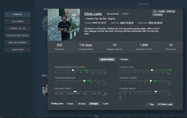
If you’re looking to find similar runners, Smashrun automatically figures out which runners overlap with you in terms of training frequency, pace, and/or volume. You can view a runner’s Quick Stats to learn more about them.
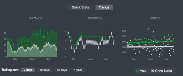
If you’re a Smashrun Pro user, you can compare your Trends to other runners which you can’t do easily on Strava - or any other running app.
To recap: Strava’s Training Pack gives you access to Custom Goals, Training Plans, Race Analysis, and Filtered Leaderboards.
What you actually get are:
- weekly or yearly distance/duration goals and segment goals
- a generic 5k, 10k, half-marathon, and marathon email-based training plans
- your race splits in 5km, 1mi, or 1km segments
- and a way to filter leaderboards by age or weight
Let’s take a look at Strava’s Analysis Pack. The key features they offer runners are: Relative Effort, Workout Analysis, and Fitness & Freshness. We’ll look at these within the context of tracking performance, and understanding load or training intensity.
Quantifying effort
If you want to improve something, you start by measuring it. It could be something as simple as rating how hard your tempo felt from 1-10, or something more sophisticated like a Training Stress Score based on Threshold Pace. We assign a value to how hard we worked because it helps us establish our baseline fitness and gives us an idea of how much we improve between runs.
On Strava, they use Relative Effort to measure how hard you worked during an activity based on your HR data. They take every HR value throughout your run and check where each one is relative to your max HR, then uses that information to calculate your Relative Effort score. Like other HR based scores, there are known limitations.
HR is very easily affected by a lot of different variables such as nervousness, amount of sleep, weather conditions, caffeine consumption etc. It’s also easy for HR to drift between zones depending on the reliability of your HR monitor, which could skew your effort score on the high end. And running short difficult runs, like a 12min Cooper Test or a 1mi Fitness Test, will always have a low Relative Effort score compared to a slow 5km jog, just because of the longer duration.
That said, you can also use Strava’s Workout Analysis to measure effort. It has three components: Pace Analysis, Pace Distribution, and HR Analysis. Pace Analysis is essentially the same thing as Race Analysis, but without the race splits. Pace and HR Analysis buckets your pace data and HR data into different zones. The nice thing about this is the simplicity of having 6 pace zones and 6 HR zones. Most runners train this way so the zones feel pretty intuitive.
It’s not as granular as Smashrun’s Pro Map where you can achieve the same thing, but it is a quicker way of checking that you spent the right amount of time running at threshold for your intervals or the right HR zone for your long slow run.
On Smashrun, we try and provide different tools to help you quantify relative effort using Smashrun’s Performance Index (SPI) and Pace Trends. Like Strava, there are limitations to the scope of each one but, together, they give you a better picture of the hard work that went into any given run.
SPI is the metric we use on Smashrun to quantify effort. It is a value derived from a predictive curve based on the Purdy Points Model. In other words, it’ll help you compare runs of similar effort across various distances. But, because it doesn’t account for elevation, hilly runs will often have a lower SPI.
You can view your trailing 90-day SPI comparison on the By Run page to see how a recent run compares to your performance in other runs over the past 90 days. You can also view a distribution of your runs by distance and SPI in different time periods to see which percentage of your runs are above or below a certain SPI. Doing so gives you an idea of how often you push hard throughout the year.
Context is important when using SPI. Living in an area that’s mostly flat will result in quicker SPI gains compared to an area that’s hilly. That means it’s entirely possible to shift your predictive curve up and down, but the takeaway is that a lower curve doesn’t necessarily mean you are less fit, you might just be training under more challenging conditions.
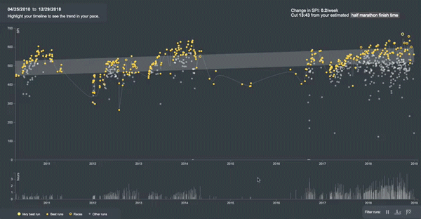
Pace Trends then uses SPI to plot your 3 best performing runs every month, across your entire running history, so you can use it to see how well you’ve improved your overall average pace over time. You can exclude any runs with pauses and treadmill runs, or only view your past races. More importantly, you can select any time period to see how much you improved during specific training cycles.
Understanding the effects of load and fatigue
Building upon the concept of quantifying effort, Strava uses its relative effort scores to calculate Fitness & Freshness. From what I can tell, they’re using trailing Relative Effort scores (based on HR) to determine the cumulative effects of daily training. The Fitness and Fatigue scores tend to be highly individualized, since it’s based on your HR zones. Initially, the scores don’t make any sense, because it takes time to establish your baseline. Over the course of a few months, you get a better idea of how well your training is progressing based on your Form (the difference between your Fitness and Fatigue scores).
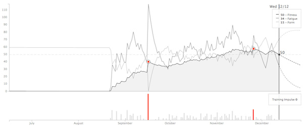
On Smashrun, there isn’t really a comparable feature that attempts to calculate fitness or fatigue, but you can use Training Bands to evaluate the effects of historical training load.
Unlike Fitness & Freshness, Training Bands don’t attempt to rate your training effort. Instead, it’s a detailed account of your effort distribution.
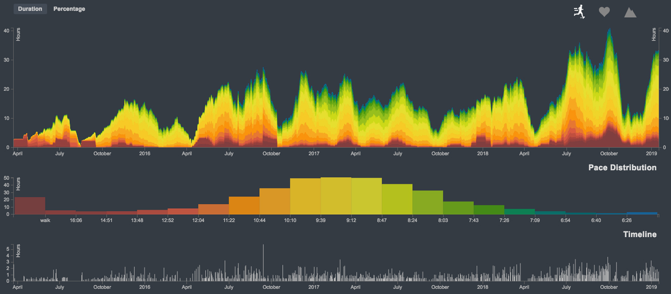
We visualize training volume using total duration of runs at different training efforts, by pace, heart rate, and hill grade. This allows you drill down into how hard you worked historically, so that you can better manage future training volume at varying intensities.
A good way of looking at it is, Fitness & Freshness lets you see the effects of day-to-day training, whereas Training Bands lets you evaluate the effects of historical training.
So in terms of analytical functionality, Strava gives runners a Relative Effort score, Workout Analysis, and Fitness & Freshness. There’s also Power Analysis, but data from a Stryd power meter didn’t seem to get applied to Fitness & Freshness.
What you actually get are:
- a HR-based score for Relative Effort
- Fitness and Fatigue score based on trailing Relative Effort
- 6 pace zones, and 5 HR zones
The thing to keep in mind is that Smashrun and Strava have different ways of analyzing run data. And for some runners, the two apps complement each other.
Strava’s Summit plan has a variety of pricing options. If you buy the complete 1-year Summit plan, it costs $59.99/yr, quoted as $5/mo billed annually. If you buy just the Training and Analysis portions, it’s $47.98/yr (about $4/mo). If you opt to pay month to month, Summit is $7.99/mo ($95.88/year) or $5.98/mo ($71.76/yr) for just the Training and Analysis portions.
Smashrun Pro is $59 for a year or $29 for 4 months.